Home Our work Visual Identities | Skincare
Case study · Branding
Visual Identities | Skincare
Three logo directions for a skincare brand, each with its own palette.
Start a project like this
Industry
Skincare & wellnessService
Logo design, brand identityDeliverables
7 visualsBrand colours

Visual Identities | Skincareby FulFill It · Branding
Hire us
About the project
The idea, in short.
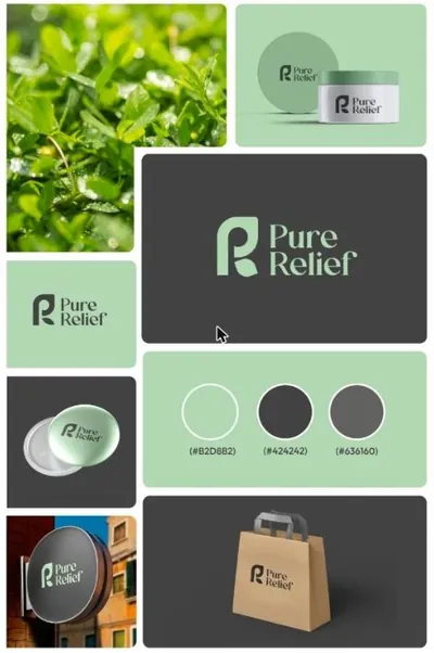
For Pure Relief we explored three distinct visual identities before settling on a direction: a clean R monogram, a botanical leaf mark and a graceful flowing symbol. Each concept comes with its own palette, typography and product mockups, so the client could see how it would live on packaging.
#12A584
#1F5A38
#C46A36
#F2EBDD
Creative fields
- Logo design
- Brand identity
- Branding
Tags
- Visual Identities
- Skincare & wellness
- Branding
- Lahore design agency
FulFill ItLahore, Pakistan
Creative design and marketing agency. Branding, social media, web and growth marketing for ambitious brands.
Follow
InstagramFacebookLinkedInStart a project WhatsApp us
What we delivered
The work, piece by piece.
01
Concept 01
A confident R monogram in a fresh teal palette.
02
Concept 02
A botanical leaf mark in deep forest green.
03
Concept 03
A flowing mark in warm terracotta tones.
Start your project
Tell us about your brand.
Share a few details and we will reply within 24 hours with ideas and next steps. No commitment.
- 01
You send a short brief
- 02
We reply with ideas and a quote
- 03
We design, you approve, we deliver
Inspired by Visual Identities | Skincare
More from FulFill It
Keep exploring.
Branding · Skincare & wellness
Logo Identity | Pure ReliefBranding · Real estate
Hudaya | Logo Identity | Real EstateBranding · Finance & advisory
Finance Ora | Brand IdentityNext case study
Logo Identity | Pure Relief
The final Pure Relief logo identity, applied across packaging and stationery.
View project ← Previous
Want a brand like this?
Tell us about your business and we will map the first steps.
Book a meeting See all work
FulFill It homeThoughtful marketing. Meaningful growth.
SEO, paid media, social, design, web and Shopify automation from one team in Lahore, serving clients worldwide.
FacebookLinkedInInstagramYouTube
Book a meeting
Get in touch
contact@fulfillit.pk
+92 321 0444892 WhatsApp
+92 306 5939776
FulFillit, House #7 Street 1, Super Town Cantt, 54791, Pakistan
Services
All services
SEO
Paid media
Social media
Web development
Design and content
Shopify PL offers
White label
Company
About us
Our team
Our work
Careers
Packages
Contact
Resources
Blog
Free audit
FAQ
Case studies
Custom quote
Book a meeting
Secure and privateEncrypted site, your data stays with us
Written agreementsScope and price confirmed upfront
24-hour replyA real person, within one working day
Clear PKR pricingNo hidden fees, ad spend billed to you
Cancel with noticeFlexible monthly retainers
We accept
VISA
JazzCash
easypaisa
Bank transfer
Secure payments
© 2026 FulFill It. All rights reserved.
Privacy policyTerms of serviceRefundsCookiesAll policiesBack to top